Inline loading
The inline loading component provides visual feedback that data is being processed.
Live demo
This live demo contains only a preview of functionality and styles available for this component. View the full demo on Storybook for additional information such as its version, controls, and API documentation.
Accessibility testing statusFor every latest release, Carbon runs tests on all components to meet the accessibility requirements. These different statuses report the work that Carbon has done in the back end. These tests appear only when the components are stable.
For every latest release, Carbon runs tests on all components to meet the accessibility requirements. These different statuses report the work that Carbon has done in the back end. These tests appear only when the components are stable.
Overview
Inline loading spinners are used when performing actions. They notify to the user that their request is being processed. Although they do not provide details about what is occurring on the back-end, they reassure the user that their action is being processed.
Common actions that benefit from inline loading include any create, update, or delete actions that may have a lot of data to process. It can be used in a table, after a primary or secondary button click, or even in a modal.
When to use
- Use an inline loading component for any action that cannot be performed instantly and will only require a short time to process.
- Use when retrieving or refreshing small data amounts, such as status.
When not to use
- Don’t use inline loading for full page loads, use skeleton states instead.
- Don’t trigger inline loading on more than one item or action at a time, unless on initial page load or refresh.
Formatting
Anatomy

- Loading status: indicates the state of the loading sequence (active, inactive, finished, error).
- Label (optional): assistive text that explains the loading status.
Placement
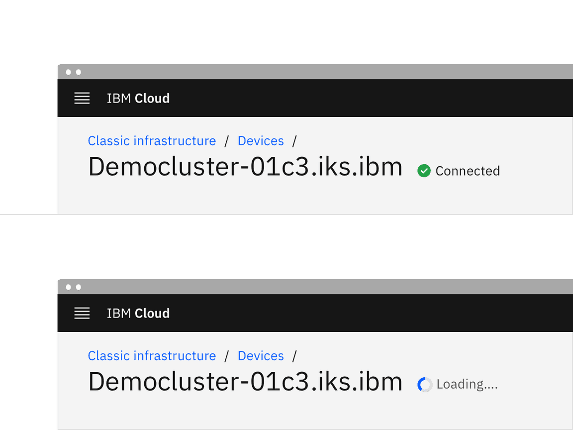
When inline loading temporarily replaces content, it should appear in the same spot as the content it replaced and maintain the same alignment.

Content
Main elements
Label (optional)
- Descriptive loading text for the action is optional, but encouraged. If you have limited room or find adding text to be unnecessary you can just run through the animations.
- The label should describe the state of the action being performed. For example, if the status is active while a form is being saved, then the label should say “Saving …”.
- Once the loading status changes to finished, the label should change. For example, when saving is finished, it would read “Saved”.
- If the loading status changes to error, then the label should change to tell the user that an error or failure has occurred.
Further guidance
For further content guidance, see Carbon’s content guidelines.
Behaviors
States
There are four states to inline loading: inactive, active, success, and error.

Inactive
The inactive loading state is when no data is being loaded. Inactive has no visual indicator.
Active
The active loading state indicates that the action is still in progress.
Success
The success loading state indicates that the action completed successfully. The success state is active for 1.5 seconds before calling an optional function
onSuccess
onSuccess
Error
The error loading state indicates that the action did not successfully complete. If an error occurs, the inline loading component becomes inactive and an inline notification or error handling within the form should appear.
Interactions
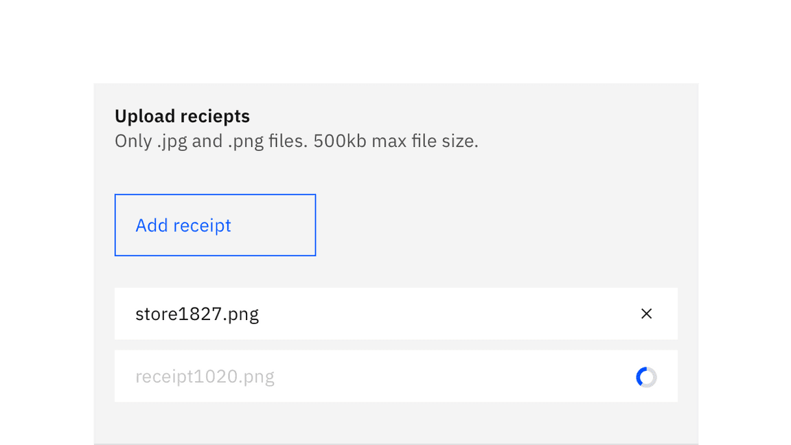
Any interactive elements associated with the item that is loading should be disabled until the loading is complete. For example, in a file uploader the item that is loading is disabled until fully uploaded. If the inline loading is being used to submit a form, the form fields should be disabled until the loading is complete.

Modifiers
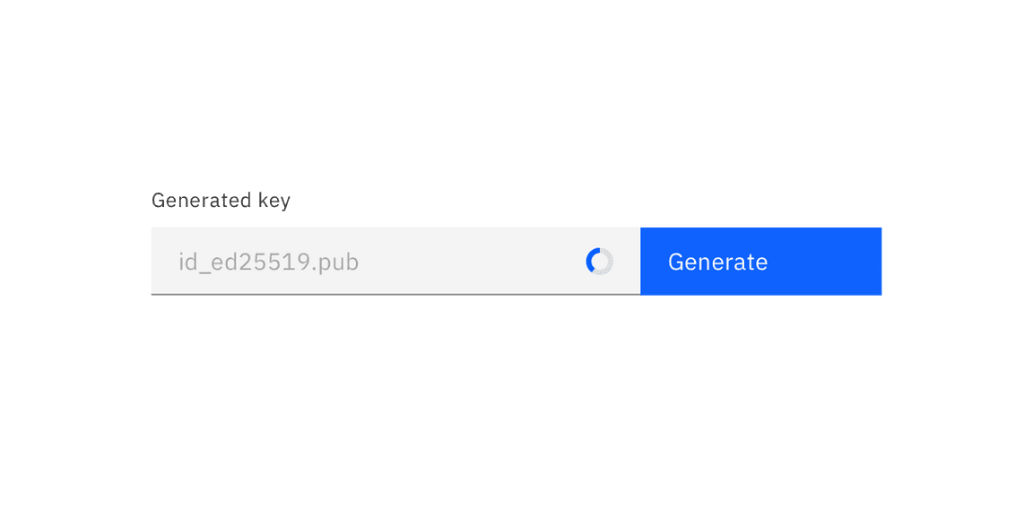
If an inline loading icon can gain context from an label, it can be used by itself without a visible label. It is most commonly used this way inside a field input.

Related
Feedback
Help us improve this component by providing feedback, asking questions, and leaving any other comments on GitHub.